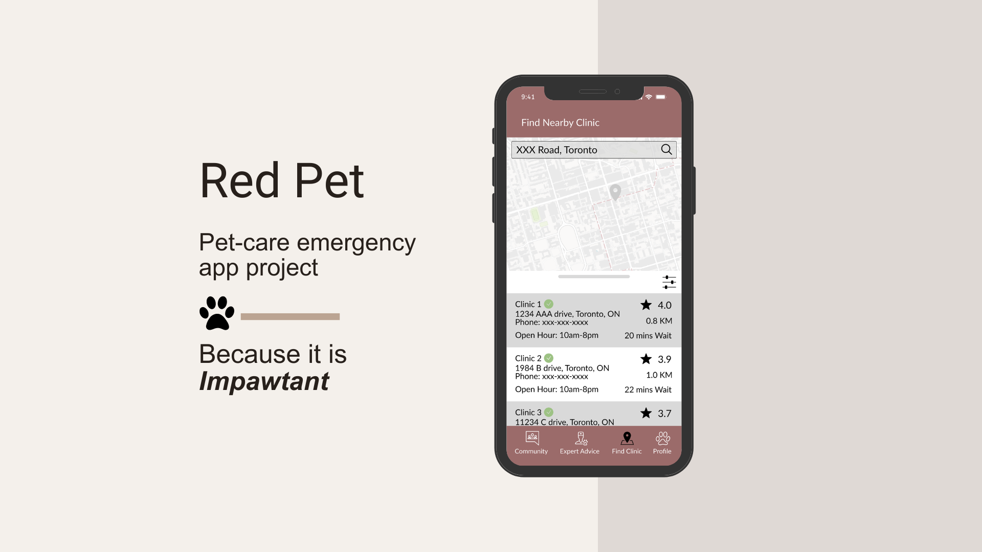
Red Pet: Pet-Care Emergency
Course Project for INF 1602, University of Toronto iSchool
Group Member:
Yue Cao, Yuxin Chen, Ka Yeung Ho,
Kewen Wang, Chi-shiun Yang
My Role:
Interview Moderator, Visual Design, Ideation, Prototyping
Tools:
Google Survey, Figma
Context
There is a large number of the population who own a pet or plan to own a pet as a companion, especially after we experienced the solitude situation during the pandemic. However, not all of them are well-prepared to take the best care of the new family member.
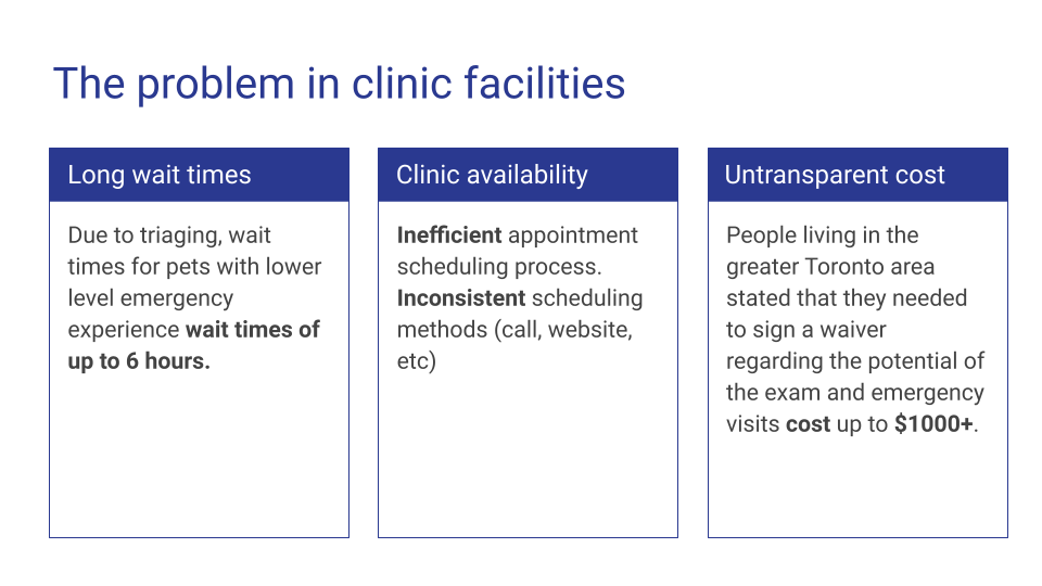
What happens when pet owners don’t know how to identify illness symptoms? What happens when something goes wrong and pet owners can’t locate an available clinic that matches their expectations?
How can we help pet owners to get prepared for any emergency their beloved pet might run into?
Our Persona: Peter the Pet Owner
A new-grad single male in his 20s, currently lives alone in downtown Toronto with his cat Milu. He sees her as a family member since they have been together for over 8 years.
As any pet owner, Peter wishes nothing but for Milu to be happy and healthy. Thus Peter needs to always be prepared for any medical issue or emergency that could happen.
One morning, Peter notices Milu is showing sick symptoms, low energy, refusing to eat, and coughing occasionally.
Peter needs to take action. But what action?
Understanding the Problems
To understand the challenges pet owners in the Toronto area are facing, our team conducted research in both survey and interview format. Based on the results we received, we identified several pain points:
Many reported the following need:
Better education on recognizing symptoms of illness to avoid delayed treatment and unnecessary anxiety.
Easily accessible online resources or reliable remote sources to consult for minor pet health issues
Financial strategies and prepared for unexpected healthcare costs associated in advance.
Since our team can’t produce vets or make the clinic open longer, we will focus on what is controllable. Our project will address this gap by creating a digital platform that centralizes pet emergency information and educational resources.
Main Objectives
Peter needs a way to find reliable information and education so that he can identify his pet’s situation and take the best action.
Peter needs a way to develop a financial strategy for owning a pet so that he has less financial pressure.
Peter needs a way to make a quick, precise decision about which emergency clinic to visit so that his pet can receive care when needed.
Peter needs a way to be distracted or calmed during a busy clinic visit so that they don’t experience intense emotions of grief and self-blame.
Ideation
With the above needs in mind, I proceeded to draft some initial ideation for the prototype. Our team decided to create a Mobile App as the format matches our goal of a “digital platform that centralizes pet emergency information and educational resources.” The following sketches represent different aspects of solutions regarding different pain points we discovered earlier.
Prioritization of Idea
We plotted initial ideas into the prioritization grid.
"Home Runs" - obvious choices we want to implement since they create high impact and are feasible to implement: Real-time Clinic Info and Clinic Review.
"Big Bets", "Quick Win" - ideas either required some effort to implement or were relatively low in impact.
"Marginal Gains" - ideas we chose to ignore since they provide low impact and are not very feasible.
What will be Different?
Below are two storyboards showing “how things are now” and “how they could be”. If we implement our ideal solution, we can make a real difference for Peter the Pet Owner:
Spot illness symptoms using reliable educational resources.
Get up-to-date clinic information and reviews, easier to choose the right clinic.
Plan for medical expenses, reducing financial pressure
As-Is Scenario: the current journey of Peter the pet owner during an emergency visit.
To-Be Scenario: the ideal journey of Peter the pet owner during an emergency visit.
we will fine-tuned our prototypes to make sure they match with these positive changes in Peter's experience.
Areas of Focus for Initial Prototype
Peter can check the clinic information, such as opening times, capacity, wait times, and reviews, more accurately and centralized than Google Maps.
Peter can acquire visual search results for them to determine their pet’s condition without needing previous knowledge of specific terminology.
Peter can create a personal pet information log to document their pet’s previous medical history to assist conversations during vet visits.
LoFi Prototype
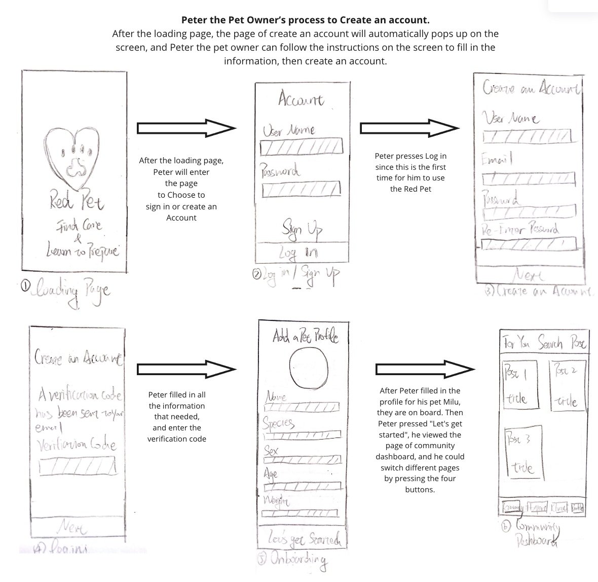
Onboarding Process, Signup and Create Pet Profile
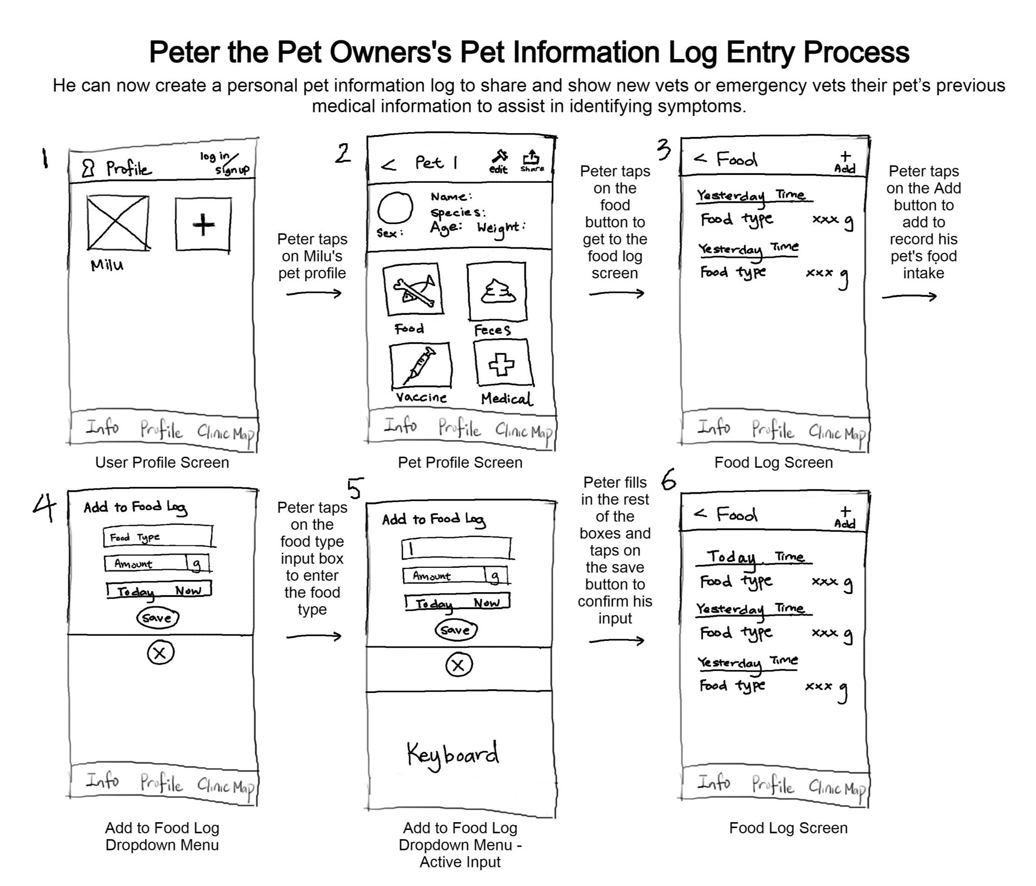
Profile Landing Page and Add Food History
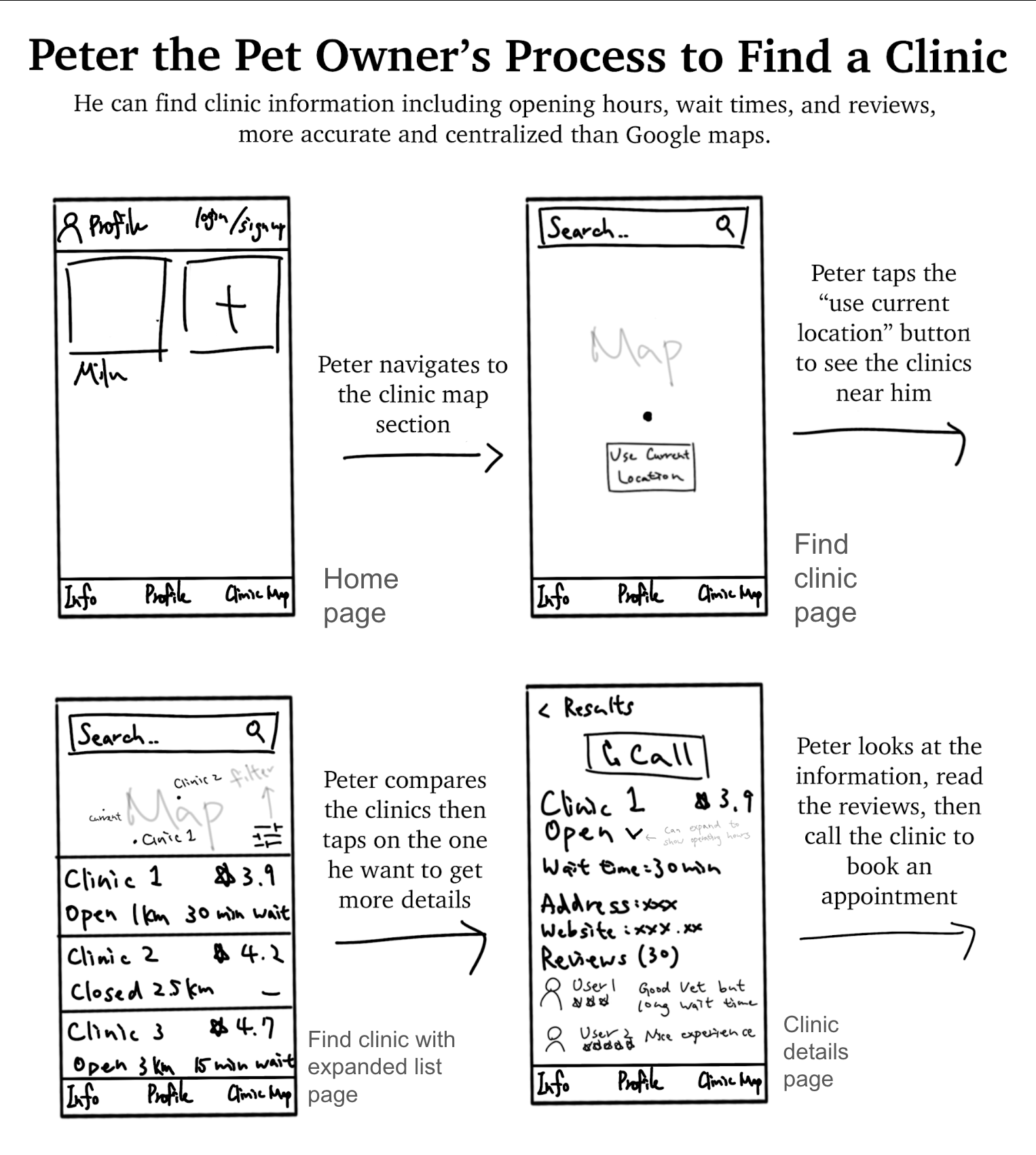
Find Nearby Clinic and View Details
Validating the Design with Feedback
To find out if our initial prototype matched our goal, we asked participants who fit our persona to conduct 3 lean evaluations before we proceeded to prototype in Figma.
I moderated 1 session including observation and interview. During the usability testing session, I asked the participant to perform a list of tasks and observed while the participant showed what tapping actions were needed in order to complete the task. After participants finished the 5 tasks, they got a general understanding of the prototype. Then 5 questions regarding their experience were asked.
Questions asked include:
Do you notice what features are provided? If so, can you summarize?
Was there anything that caused you frustration during the process?
Was there any part of the experience that was surprising to you?
Follow up: What other features would you find useful in our product?
Wireframing the Solution and Iterations
Our Mid-Fi prototype focused on the 3 areas of focus, with some additional features. Our app is very task-oriented, for example, signing up for an account, putting information in an information log, finding a clinic, and looking for information others share. As a result, our navigation will deliver a linear structure with the right amount of levels to avoid confusion or frustration.
We ended up with 4 main categories on the bottom navigation bar:
Profile: to keep records of pet
Find Clinic: to locate available clinics around
Expert Advice: to view licensed vet’s published articles and tips
Community: to browse other pet owners’ experiences and post personal stories
Mid-Fi Prototype
After the team collectively agreed on the features and navigation design of the mid-fidelity prototype, I created the basic frames and design layout in Figma. Another team member helped to turn the prototype into an interactive, clickable product.
While no fancy graphic design was needed during this stage since we will run iterations in the next steps, I made sure that the font and color followed the visual design principles for mobile apps.
Figma prototype with interactive flow
Conclusions and Next Steps
A summative evaluation was conducted after the Mid-Fi prototype was created. We focused on two main goals:
Find out whether pet owners can successfully locate available clinics and access reviews with the app.
Find out whether pet owners can learn more about pet-related education within the app.
Things that Worked:
Most features were comprehensible and easy to navigate through without guidance.
Labeling of the navigation bar makes sense to first-time users.
Things to Change:
Recording information in Profile seems too complex
Documenting food history seems unnecessary
Questions Emerged:
Is the Pet Information Log (record keeping) feature really necessary?
How will the quality of real-time data and reviews for vets in Find Clinic be maintained?
New Ideas:
Add filters to the Community page
Live Chat with a vet online
For next steps, our team plans to:
Conduct more evaluations and gain feedback from a larger sample of pet owners.
Re-evaluate if we need the information log feature.
Employ different methods of usability testing, such as field studies, to see how our app is being used in action.
Go through the iteration process to see if we can make the feature match the users’ needs more.
Create a high-fidelity prototype and put our product through a test run.
Takeaways and Reflections
Skills I learned or reinforced during this project are:
Presentation skills, delivering project paces and stages with visual slides and strong concise speech
Ideation, generating new ideas
Collaboration, being inclusive and actively participating in discussions, making every member of the team is on the same page
UX prototyping, designing LoFi and Mid-Fi frames with tools
UX research, initiating interview and evaluation session
This project helped me to understand what an UX work process feels like, as I entered the UXD program as a first-year at iSchool, University of Toronto. I noticed some similarities between my previous background and UX in many aspects, including but not limited to:
The relationship and interaction with my peers
Work process that begins with initial research stages following ideation and many iterations
Soft skills like responsiveness needed to maximize outcomes and meet requirements


